iOS 13’s Music App
This essay is more of a rant. I knew it coming in, and now you do too.
iOS 13’s official Music app is a stinking hot pile of garbage that gets worse every year. Why, oh why, does it feel like nobody uses this app before they ship it?
First things first, why do I get a tab bar with 5 icons, and I only ever use 2 of them? I don’t care about “For You”, “Browse” and I certainly don’t give a rat’s ass about ”Radio”. Back in iOS 8, maybe 9, you could pick and choose the options you had on your tab bar. You could have your playlists accessible from anywhere instead of only at the top of the Library screen.
You might argue that Apple needs to push its services (such as Apple Music) since hardware sales are declining, and making For You, Browse, and Radio tabs are a good way to advertise them. Fine, that’s fair, that’s just business. Except that I already pay for Apple Music, I don’t use these tabs, and I’m considering leaving Apple Music for Spotify because these tabs (and other “features” that we’ll discuss later) annoy me so much. Not a good business decision after all.
Next, Apple Music has a lyric search feature, where you can type the line of a song into the search bar and it will do its best to find it. It’s an excellent way to find songs, rather than using a browser and then searching again for the song in the Music app. Except it doesn’t work on songs in your library. Compared to the 15GB of songs I have (about 3,000), it seems that storing the lyrics in a text format would add a trivial amount of local data. Why then, can’t I search for lyrics in songs I already have downloaded?
In general, the local search is quite bad. When searching the Apple Music catalog, I can type in “drake how about now” and find Drake’s song “How Bout Now” as the first result. When I switch over to “Your Library”, no results. Even “how about now” shows nothing. I need to type in “how bout now” before it will show up. This local search is just a series of regexes, not real search. It’s 2020. We have better search than this.
Finally, the Now Playing screen. Arguably the screen I spend the most time on, and the screen that has progressively gotten worse as time passes. Upon first glance, it’s simple enough. Go back, play/pause, next song buttons. A volume slider, the album art, the song name and artist name. Very standard, very understandable. Swipe down to dismiss the page.
But let’s talk about four little icons that turn this page into a living nightmare. The ellipsis, the speech bubble, the Airplay (maybe?), and a queue-looking thing.
First off, icons as buttons without labels. It’s a big no-no. To be fair, each of these icons is pretty self explanatory, if they only did what they were labeled as.
The ellipsis is the generic “there’s more stuff here” button. Clicking on it does bring up a modal with generic actions: Copy, Share, Remove. Fine. But then it includes stuff like “Add to a Playlist”, “View Full Lyrics”, “Create Station”, “Love”, “Suggest Less Like This”. These are semi-critical functions; in this age, I would argue that Remove and Add to a Playlist are seriously important: we have a lot of music, so getting rid of some and adding some to playlists for future reference is critical. It’s foolish of Apple to hide this functionality behind a button that has generally signaled unimportance: additional features that aren’t critical. But for Apple to mix important things like “View Album” and “Remove” with “Suggest Less Like This” (I don’t even know what that does”) is poor UI design. There needs to be a clear separator.
To Apple’s credit, you can move them around with “Edit Actions”, and pick your “favorite” actions to move them to the top. But it’s an iPhone. I shouldn’t have to configure this kind of stuff, especially if I’m going to be paying $120 a year to use this app.
And the ellipsis isn’t even the worst offender. The Airplay icon is fine. Serious iOS/iPhone users know what it is, and casual users probably don’t care. The speech bubble isn’t hard to figure out: you click on it, lyrics show up. I did only recently just find out that clicking on a lyric jumps the song to that portion of the song. Very cool, especially if I could search for a lyric.
To be honest, the lyric feature is really cool from a technical point of view. It just feels like it was designed for fun by a couple of engineers who then just dropped it into the app with a lot of priority because it was difficult to implement. This feature would’ve made a lot of sense in the ellipsis menu.
And finally, the queue button. The single worst reason that I’m considering Spotify. This button is the worst piece of UI design I’ve seen recently, and is one of the reasons that Apple Music feels so awful. The shuffle button is hidden in this menu. For years, shuffle and loop have been on the middle of the now playing screen.
Here are pictures from iOS 7, 8 and 9 (note, these aren’t my images, rather random ones I found online. Sorry for the quality).
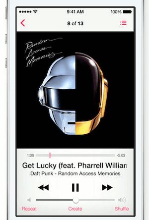
All of them show the shuffle and repeat button. They also manage to squeeze in the queue and ellipsis buttons.
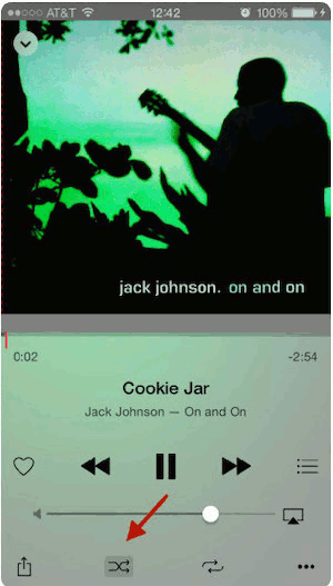
Here’s iOS 13:
Yes, dark mode is nice. Yes, visually, I prefer iOS 13. It’s very pretty (I’m not being sarcastic, it really is). Except in terms of actually using the app, all of these previous options were better.
To be fair, the updated Now Playing screen came about in iOS 10. I’m just picking on it here because iOS 13 introduced additional problems.
And then the queue on the Now Playing screen is trash (once you get there). Rearranging the options is difficult because the Previous/Pause/Next buttons keep fading in and out based on which way you’re scrolling, randomly hiding a third of the songs you’re looking at.
So Now Playing is a hot piece of garbage and 3 of the 5 tabs on my tab bar are completely irrelevant to me.
What’s good about this app?
Not the Playlists screen.
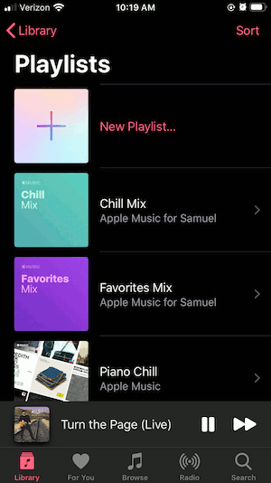
Sure, 4 playlists on a page. Gotta love that whitespace. Maybe the images are what I’m supposed to focus on, except that instead of album art (like every other playlist), Apple’s playlists are just boring gradients. These rows could be half the height and be incredibly more useful.
The Songs, Genres, Artists, and Albums pages are fine. They’re just lists, which aren’t as offending as the Playlists list.
Spotify
I wrote most of this essay back in 2019. In 2020, I took advantage of Spotify’s free trial. Spotify also makes me mad.
The Now Playing screen on Spotify is different based on whether you’re listening to a Daily Mix or a playlist. The one screen that should be consistent? Different, based on a context I wasn’t aware of.
In Spotify, you also don’t really have the concept of a library. You have a playlist with all the songs you “liked”, but not a Songs tab. If you like an album, the songs aren’t added to your Liked Songs (a fact I discovered after liking KIDS SEE GHOSTS and then not hearing any of the songs, ever).
The queue also has rearranging issues, which means that perhaps dragging in iOS is broken, which can’t really be blamed on the Spotify or the Apple Music teams.
Spotify overall has a better interface, except for the lack of a Library, which makes me irrationally unhappy. Perhaps it comes from my carefully curating my music collection with iTunes and Apple Music. If you don’t mind not having a “Library”, then Spotify is a great app. I mind.
Closing
I’ve ranted enough. I wish I could do something about fixing them. Building an Apple Music app using their API is possible (but not feasible for many, many users).
Maybe I should just be impressed and satisfied that we have the infrastructure to stream any song I want, on demand, from any device I own. Maybe.
Please email me if you have any comments or want to discuss further.
HackerNews discussion here.
The most useful tidbit (for me) was barrowclift’s link to his review of alternate music players.
Sam Stevens, 2024